Browsed by
Tag: photoshop

Re-design of training guides and Manuals for the NWCG training programs

Re-design of training guides and Manuals for the NWCG training programs

In researching topics to use for the creation of a graphics project, I didn’t see a clear topic, especially for my blog page, until I was in a recent class, and it clicked. Almost every training book from the National Wildfire Coordinating Group, NWCG for short, is elementary and lacks any luster.

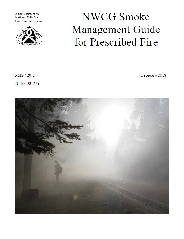
Here is the original NWCG guide cover and my version of the guide. The USFS has created a design that is probably as good as it needs to be and certainly saves on Ink. However, the cover photos of these module books never tell a story of the work that’s being done. In fact, the original guide cover shows a silhouette of a firefighter in heavy smoke that is not being managed well or has no relevance to the management efforts.
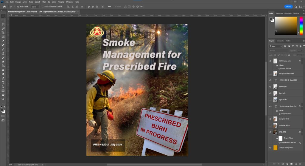
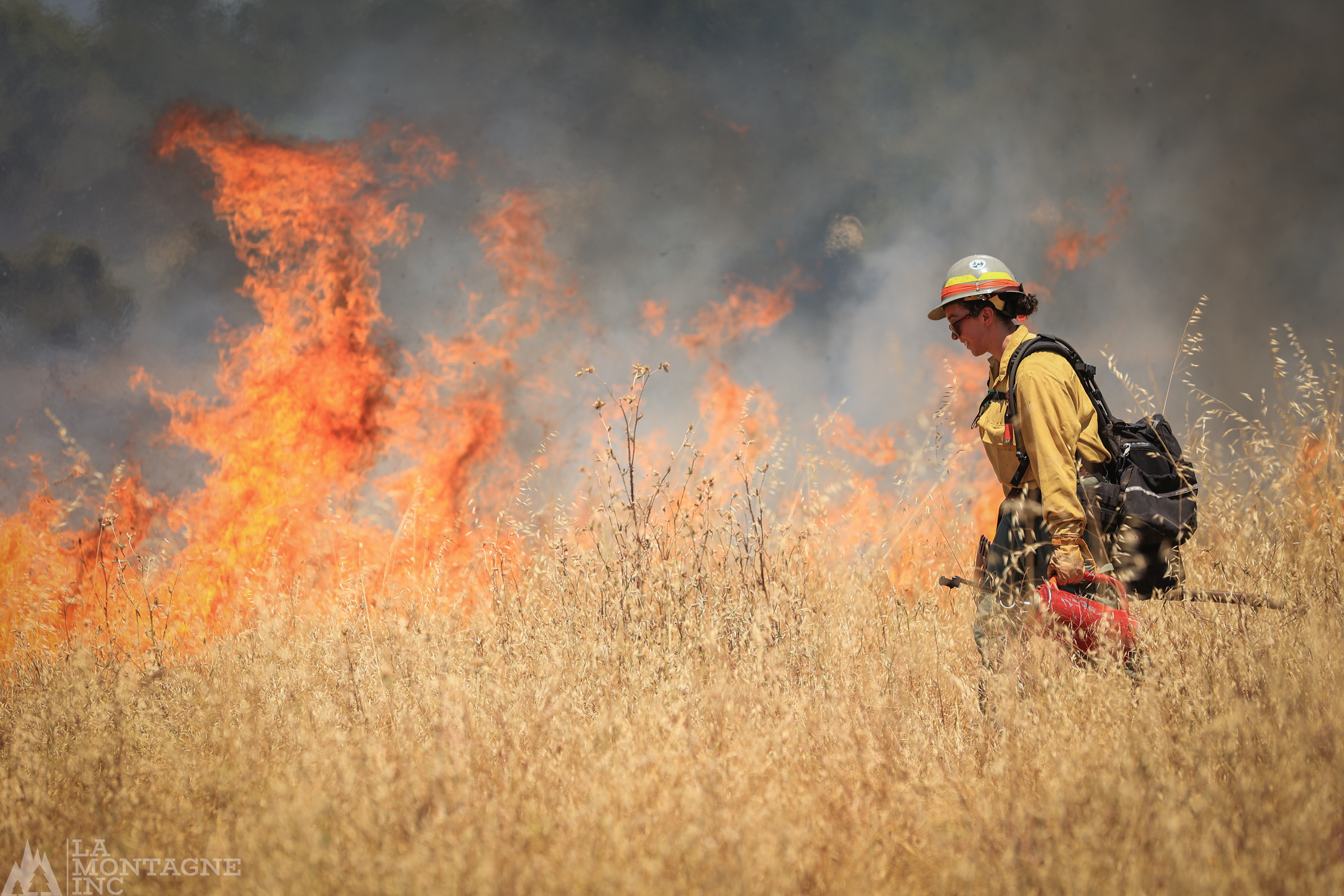
I decided to feature three of my original photos showing some basics. The background features a beauty shot showing the slow release of light smoke in a Redwood Grove illuminated by beams of sunlight, a fire practitioner using a drip torch controlling heat and smoke release, and a sign that shows the importance of public information, even if it’s a small effort near the unit. 

The design was intentional. For the wording, I left it simple. I used the least number of words necessary to get the point across. I dropped the “NWCG” and “Guide” from the title because it’s already clear what it is and where it came from. I placed a drop shadow for additional separation of the text.  I included the NWCG logo in the upper left corner, obtained from their website and used under a Copyright Fair Use legal clause, and updated the version and date in the lower left corner. I also created an obscenely large text box under the version and date because it must stand out, be obvious, and be firefighter-proof.

The photo placement is strictly based on balancing the graphic as a whole. I did not attempt to give the impression that the grass lighter was in the forest by blending the elements. I wanted them to be noticeably in different places. Additionally, the sign in the photo was from another image that looks intentionally blended to appear in the background photo, which is not the case. I placed all the images over an orange/yellow background to have some continuity of color bleeding through, as seen in the lower part of the graphic on the left of the center.
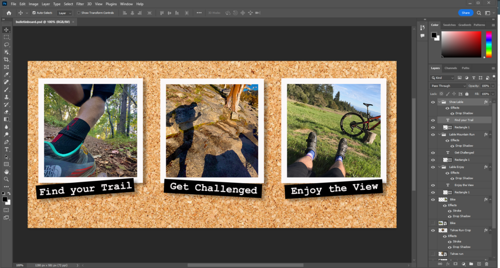
The Photoshop Workspace

On the more technical arrangement and treatment side of the details, I created a document size that would reflect the finished size, 8.5” X 11” vertical, and set the detail to 300 pixels per inch.  I gave the project that base color and changed it to one I liked. Then, I imported and embedded the photos into a new layer. For the forest picture, I adjusted it slightly to lighten and resized it, and I placed the Sunstar where I wanted it. Next, I imported and embedded the image of the igniter and set the approximate size and placement. I masked what I wanted using the magnetic lasso tool and then set it as a new layer. I repeated this process for the sign. However, the sign was shot in full shade and, when masked out, appeared very blue, and I needed to color grade that photo to match.

Adding the text and logos was a necessary evil. I wanted to make them clean and easy to read. A drop shadow on every one made them easy to read and pop out from the background.

The Importance of Imaging,

The Importance of Imaging,

My Journey with Photoshop

Imagery is possibly the most essential part of how our species interacts with information.

Before you read the article, listen to the podcast or interact with the intellectual property someone is providing, the image presented on the header or content thumbnail is the first thing that entices you and leaves a lasting impression on your imagination.

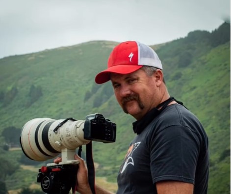
I am currently running the tailings of an almost 30-year career as a Director of photography. I’ve had the pleasure of working with some of the most creative graphic designers in the broadcast media.

Big lens in Big Sur, Capturing images of Bixby Bridge

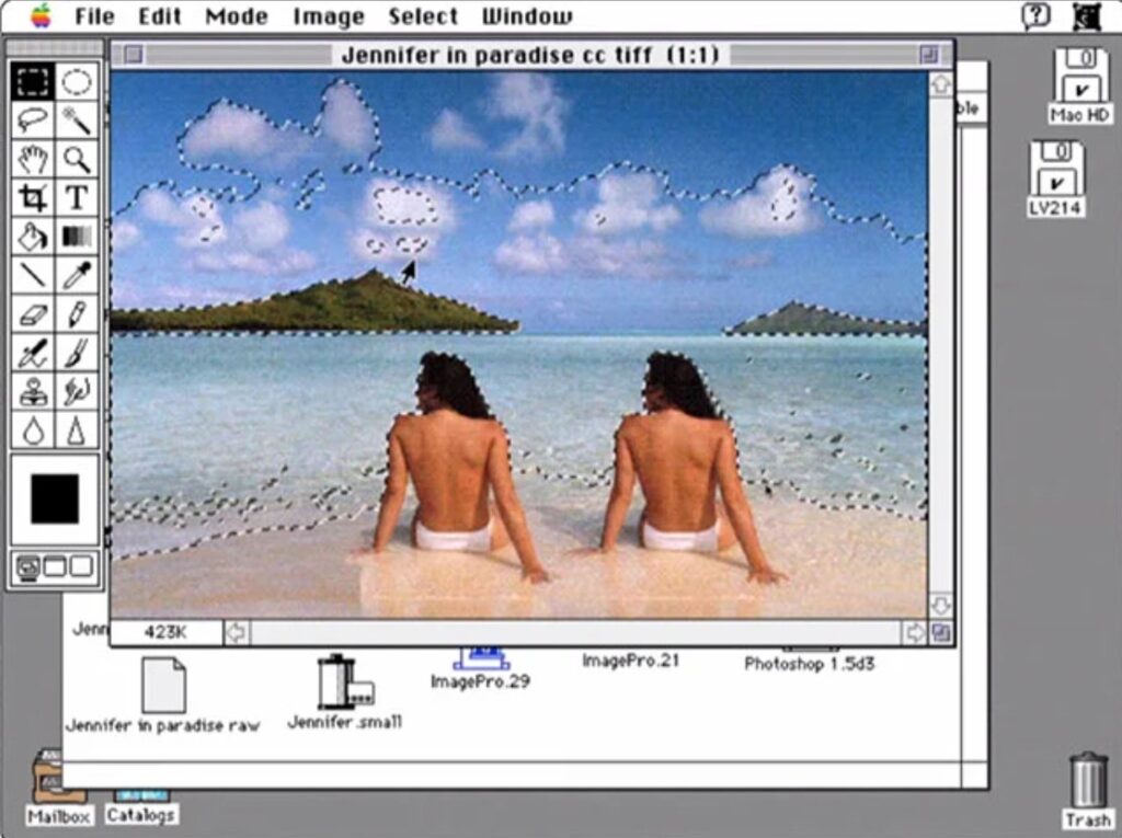
 My journey with Photoshop did not start with this assignment. It actually started nearly at the program’s initial rollout in the early 1990s with the box version of the software that needed to be installed on a Power Macintosh 9500 and licensed via email. Photoshop has grown tremendously, very far beyond my comprehension. That is why I am here. These days, I exclusively use Adobe Lightroom for all photo editing needs.

OG 1990s Photoshop UI.

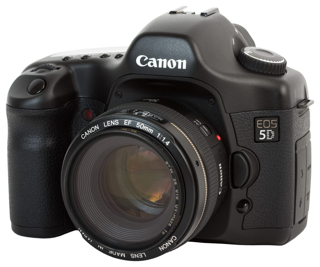
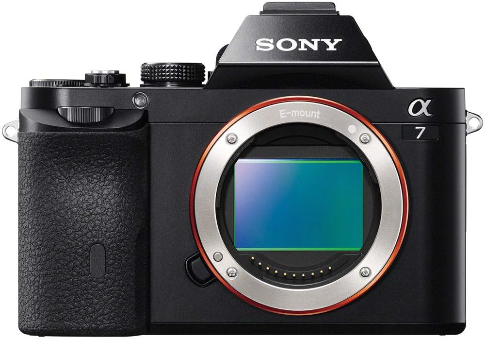
 I experienced many technical pivot points in my career. One was when Cannon accidentally introduced a video on their legendary 5D. This enabled photographers to become filmmakers and advance the quality and ease of filming while utilizing the benefits of depth of field and a large sensor. October 2005. The industry was again shocked in late 2013 by Sony’s introduction of the lightweight, visually powerful Sony Alpha Mirrorless cameras. Don’t worry if you don’t understand those details; they are not critical to the story.

Regarding the importance of imagery, an overproduced Photoshop image, heavily influenced by graphic design elements, is too much. Simplicity and cleanliness are far more important to delivering the message, just my own opinion. After all, I am a photographer and not a graphics designer.

However, it is OK to quickly see a visual representation of what the content will deliver for the purposes of that header, graphic, or thumbnail, which is to entice viewers, readers, and listeners.   

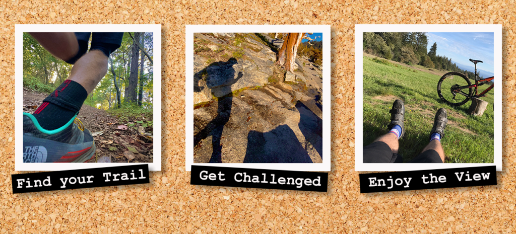
 For example, my three-panel photo is about the importance of physical fitness conditioning for prescribed fire. The key images illustrate the importance of both fitness and mental health.

Here’s a funny backstory: I directed my graphic designer to create a very similar photo on board sketch for an after-effects project. Check out the Vimeo link at about 2:35 into the video.

I shot, directed, and designed graphics for a news story for NBC News.

Photoshop was very intuitive for this project, as it is similar to using the Adobe Premiere video editing program. Terminology, workflow, and layout are familiar playgrounds.

 Navigating and finding the individual tools for layering was challenging, but the video instruction was so clear that it made it livable. However, the learning curve was steep since I had not opened Photoshop in at least 15 years.

 I try to avoid adding text to anything! I understand that text is important for titling or subtitling, but I try not to make a spectacle out of the text because I want people to focus on the image.

 I appreciate learning how to place text on two-dimensional physical surfaces like in the crinkle paper, which is huge for me. I often ask my Graphic Designer to do precisely this, and now I will know better how to articulate that point. Again, I am a traditionalist when it comes to using text. You could say a bit, Wes Anderson. I intentionally misspelled the design to see if anybody noticed a goose egg, if you will.

Finally, I found it rewarding to have a refresher on color grading, compositing (layering), and creating art pieces out of seemingly basic photos.

Frankly, after this lesson, I’ll be using Photoshop more often!

RSS
Instagram