The Importance of Imaging,
My Journey with Photoshop
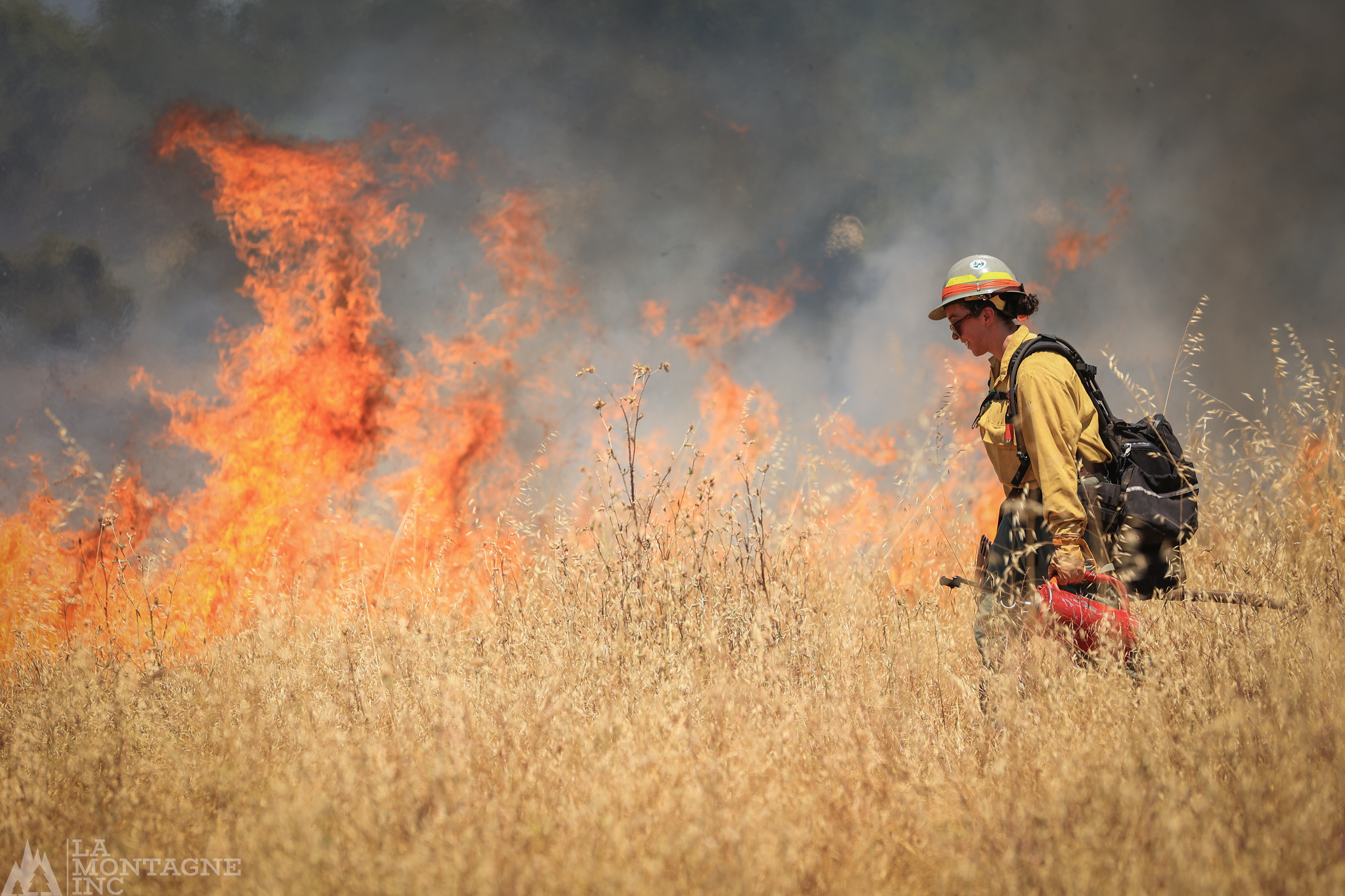
Imagery is possibly the most essential part of how our species interacts with information.
Before you read the article, listen to the podcast or interact with the intellectual property someone is providing, the image presented on the header or content thumbnail is the first thing that entices you and leaves a lasting impression on your imagination.
I am currently running the tailings of an almost 30-year career as a Director of photography. I’ve had the pleasure of working with some of the most creative graphic designers in the broadcast media.
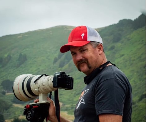
My journey with Photoshop did not start with this assignment. It actually started nearly at the program’s initial rollout in the early 1990s with the box version of the software that needed to be installed on a Power Macintosh 9500 and licensed via email. Photoshop has grown tremendously, very far beyond my comprehension. That is why I am here. These days, I exclusively use Adobe Lightroom for all photo editing needs.
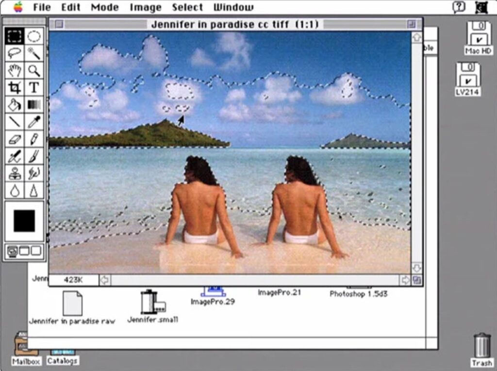
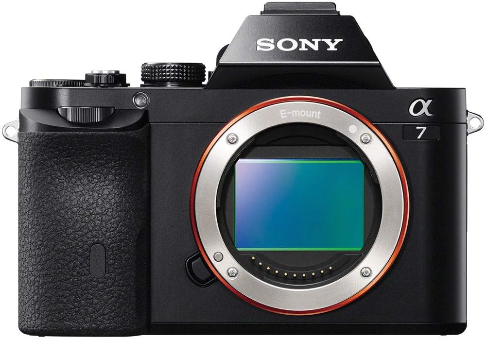
I experienced many technical pivot points in my career. One was when Cannon accidentally introduced a video on their legendary 5D. This enabled photographers to become filmmakers and advance the quality and ease of filming while utilizing the benefits of depth of field and a large sensor. October 2005. The industry was again shocked in late 2013 by Sony’s introduction of the lightweight, visually powerful Sony Alpha Mirrorless cameras. Don’t worry if you don’t understand those details; they are not critical to the story.
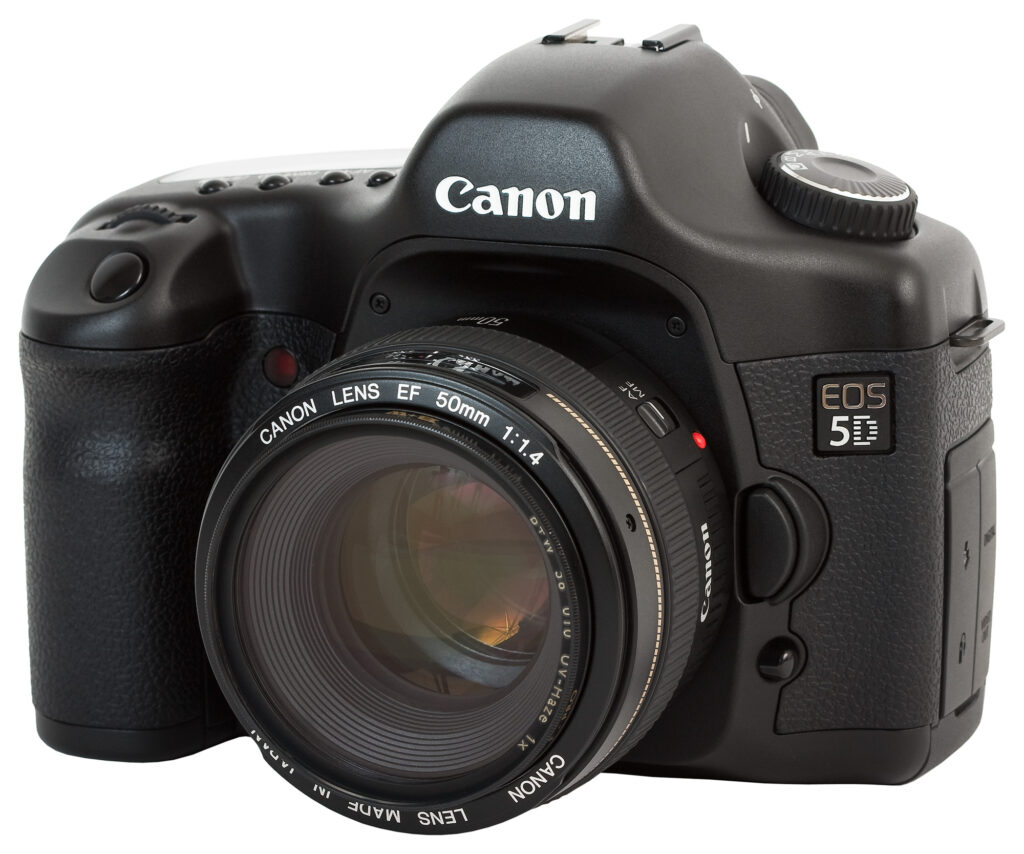
Regarding the importance of imagery, an overproduced Photoshop image, heavily influenced by graphic design elements, is too much. Simplicity and cleanliness are far more important to delivering the message, just my own opinion. After all, I am a photographer and not a graphics designer.
However, it is OK to quickly see a visual representation of what the content will deliver for the purposes of that header, graphic, or thumbnail, which is to entice viewers, readers, and listeners.
For example, my three-panel photo is about the importance of physical fitness conditioning for prescribed fire. The key images illustrate the importance of both fitness and mental health.
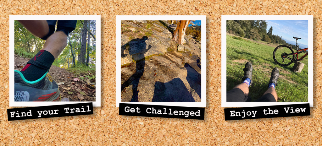
Here’s a funny backstory: I directed my graphic designer to create a very similar photo on board sketch for an after-effects project. Check out the Vimeo link at about 2:35 into the video.
Photoshop was very intuitive for this project, as it is similar to using the Adobe Premiere video editing program. Terminology, workflow, and layout are familiar playgrounds.
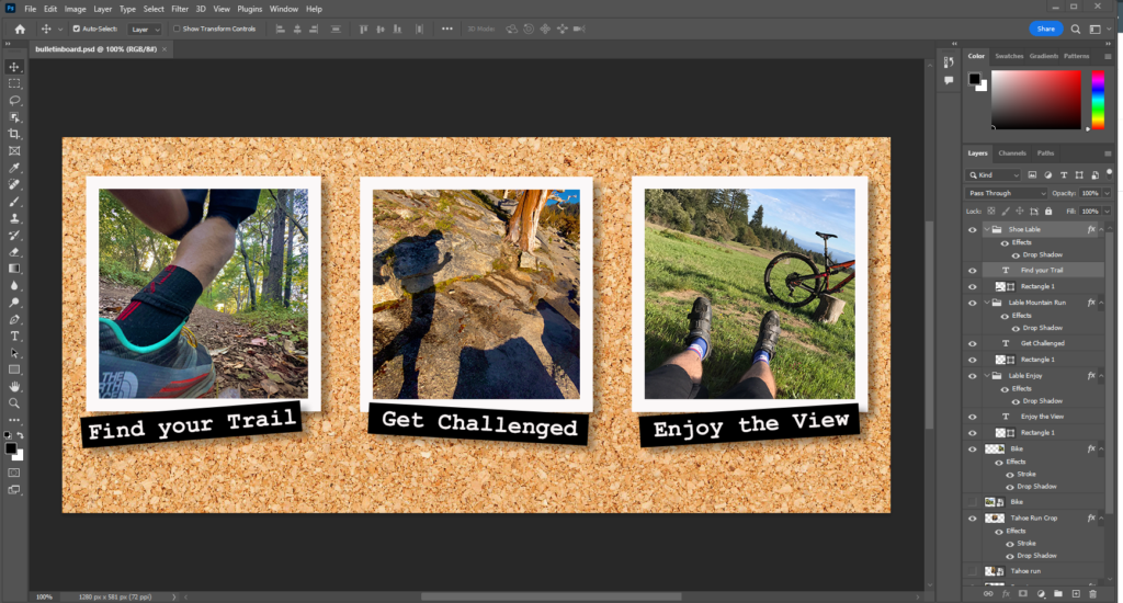
Navigating and finding the individual tools for layering was challenging, but the video instruction was so clear that it made it livable. However, the learning curve was steep since I had not opened Photoshop in at least 15 years.
I try to avoid adding text to anything! I understand that text is important for titling or subtitling, but I try not to make a spectacle out of the text because I want people to focus on the image.
I appreciate learning how to place text on two-dimensional physical surfaces like in the crinkle paper, which is huge for me. I often ask my Graphic Designer to do precisely this, and now I will know better how to articulate that point. Again, I am a traditionalist when it comes to using text. You could say a bit, Wes Anderson. I intentionally misspelled the design to see if anybody noticed a goose egg, if you will.

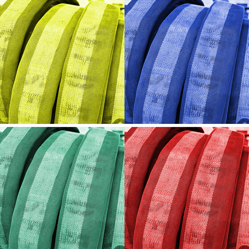
Finally, I found it rewarding to have a refresher on color grading, compositing (layering), and creating art pieces out of seemingly basic photos.


Frankly, after this lesson, I’ll be using Photoshop more often!